THE WELL CO.
VISUAL IDENTITY FOR A LONDON ONTARIO ALTERNATIVE & HOLISTIC HEALTH SERVICES COMPANY
The ladies at The Well Co. contacted me just as they were planning this new venture - coming with a “let’s make something great” attitude. They wanted to look professional and stand out in the noisy holistic health segment. We worked together on numerous ideas for their new visual identity, always keeping in mind that they wanted a brand that reflects; Growth, Evolve, Freedom, Nourish, Movement, and Connection.
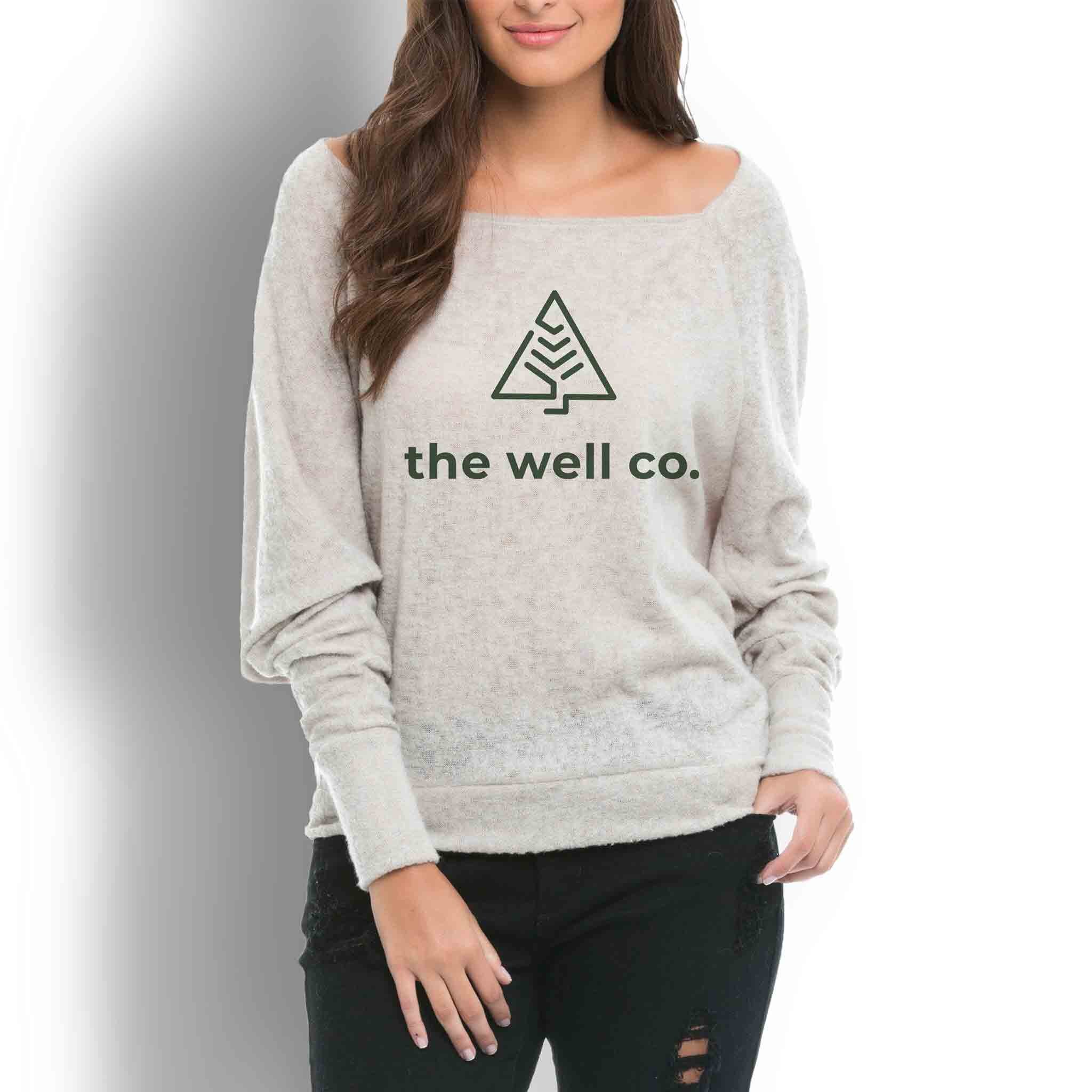
I ended up morphing a pine tree and “the journey” one takes in achieving “whole health” for their visual mark.
The pine tree is one that is a survivalist, using its own instincts to ensure it’s future is long. The journey to whole health isn’t always linear and the “path” within the pine tree represents the trajectory one takes to “find” a life free from pain and food & body image issues.